ENTERGY'S CUSTOMER DASHBOARD
Redesigning a High-Stakes Enterprise Dashboard for Clearer Decision-Making
Enterprise Dashboard
|
Large Enterprise
|
Jan 2026 - Feb 2026
My Role
As a Senior UX Designer, I led this project end-to-end, rethinking the experience beyond visual updates. I identified clarity and structural gaps and redesigned Entergy's dashboard.
About the project
This was a self-initiated case study based on Entergy’s live My Energy Use Dashboard. I treated it like a real product, working within realistic technical and regulatory constraints.
Tools Used


Is the dashboard helping customers understand what’s happening or asking them to figure it out themselves?
The PROBLEM
The current My Energy Use dashboard is scattered and hard to follow. Usage, billing, and savings tools are spread across different pages, showing raw numbers without clear explanation or prioritization.
Customers have to figure things out on their own just to answer, “How much will I owe, and can I lower it?” Without forecasting or clearly surfaced savings options, this can lead to bill shock, low program use, and more support calls.
The data is accurate, but it doesn’t make things clear. The burden of understanding is placed on the user.
SOLUTION
The solution is to restructure the dashboard around what users care about most, this month’s bill, and then layer in helpful context and actions only when they’re needed.
Heuristic Evaluation
Heuristic Evaluation
Heuristic Evaluation
Problem Framing
Problem Framing
Problem Framing
User Mental Models
User Mental Models
User Mental Models
Experience Principles
Experience Principles
Experience Principles
Strategic Direction
Strategic Direction
Strategic Direction
Speculative Redesign
Speculative Redesign
Speculative Redesign
Hi-Fi Wireframes
Hi-Fi Wireframes
Hi-Fi Wireframes
Rapid AI Prototyping
Rapid AI Prototyping
Rapid AI Prototyping

Business objective
Ensuring the experience is both correct and easy to understand
Utility companies face growing pressure to reduce support call volume, strengthen customer trust, increase digital adoption, and drive participation in energy efficiency programs. By improving dashboard clarity and prioritization, Entergy can:
💵
Decrease bill-related confusion and cost uncertainty.
🤝🏻
Increase trust in the digital experience.
🛠️
Increase engagement with savings and efficiency tools.
💡
Position Entergy as a proactive, trusted energy partner.
Observing the Experience (What I Noticed)
Metrics without meaning create user anxiety
When I landed on the dashboard, I was presented with multiple cards: usage charts, comparisons, goals, tips, and programs. None of this was wrong. But nothing answered the question I instinctively had: Am I doing okay this month?
I had data, but no direction. I had metrics, but no meaning. I had to interpret everything myself, compare months, scan charts, calculate trends. That tension became the starting point for my evaluation and redesign.

Research & Evaluation
System prioritized displaying data over supporting decisions.
To better understand the experience gaps, I conducted a structured heuristic evaluation across the MyEnergy Use Dashboard, Usage & Cost, and Bill History pages using Nielsen’s usability principles. Six key violations emerged.

Fig. Heuristic evaluation across the my Energy Use Dashboard
Visibility of System Status
No clear trends or bill forecasting, making it hard to know if users were on track.
Match with Real-World Mental Model
The dashboard spoke in technical metrics, while users think in months and dollars.
Recognition Over Recall
Usage, billing, and savings were siloed, forcing users to piece information together.
Visual Hierarchy & Minimalism
Multiple charts competed for attention without clear prioritization.
Help Users Understand Issues
Increases in usage weren’t clearly explained, leaving users to interpret trends themselves.
Proactive Guidance
Savings tools were passive and disconnected from real-time insights.
Understanding the User
Most customers don’t visit an energy dashboard out of curiosity,
they visit when they’re concerned.
Energy is a variable monthly expense, and unpredictability creates anxiety. Users log in with simple, high-stakes questions:
How much will I owe?
Is this higher than last month?
Can I reduce it before the bill arrives?
They think in dollars and timing, not kilowatt-hours or efficiency tiers.
Primary Persona
The Cost-Conscious Household Manager
Profile
Logs in 1-2 times per billing cycle
Responsible for managing monthly expenses
Not technically inclined
Motivated by predictability and savings
Pain Points
Scattered information
No bill forecast
Charts without explanation
Unclear next steps
Goals
Avoid bill surprises
Understand why costs changed
Adjust behavior before the cycle ends
Defining Experience Principles
Aligning experience with user priorities
To move beyond cosmetic improvements, I established five guiding principles. These principles became the foundation of the redesign.
1.
Prioritize what matters now
2.
Make energy financial, not technical
3.
Surface insights, not raw metrics
4.
Introduce forward-looking forecasting
5.
Enable action in context
Redesign overview
From static reporting to proactive energy guidance
A clear insight emerged: the dashboard made users interpret everything themselves. It showed data, but not meaning. And in a high-stakes product tied to monthly bills, that uncertainty erodes trust.
The redesign shifts the experience from passive reporting to proactive guidance, clearly showing where users stand, what’s next, and what they can do about it.
1. Energy Snapshot
From scattered metrics to instant financial clarity, giving users confidence before concern.
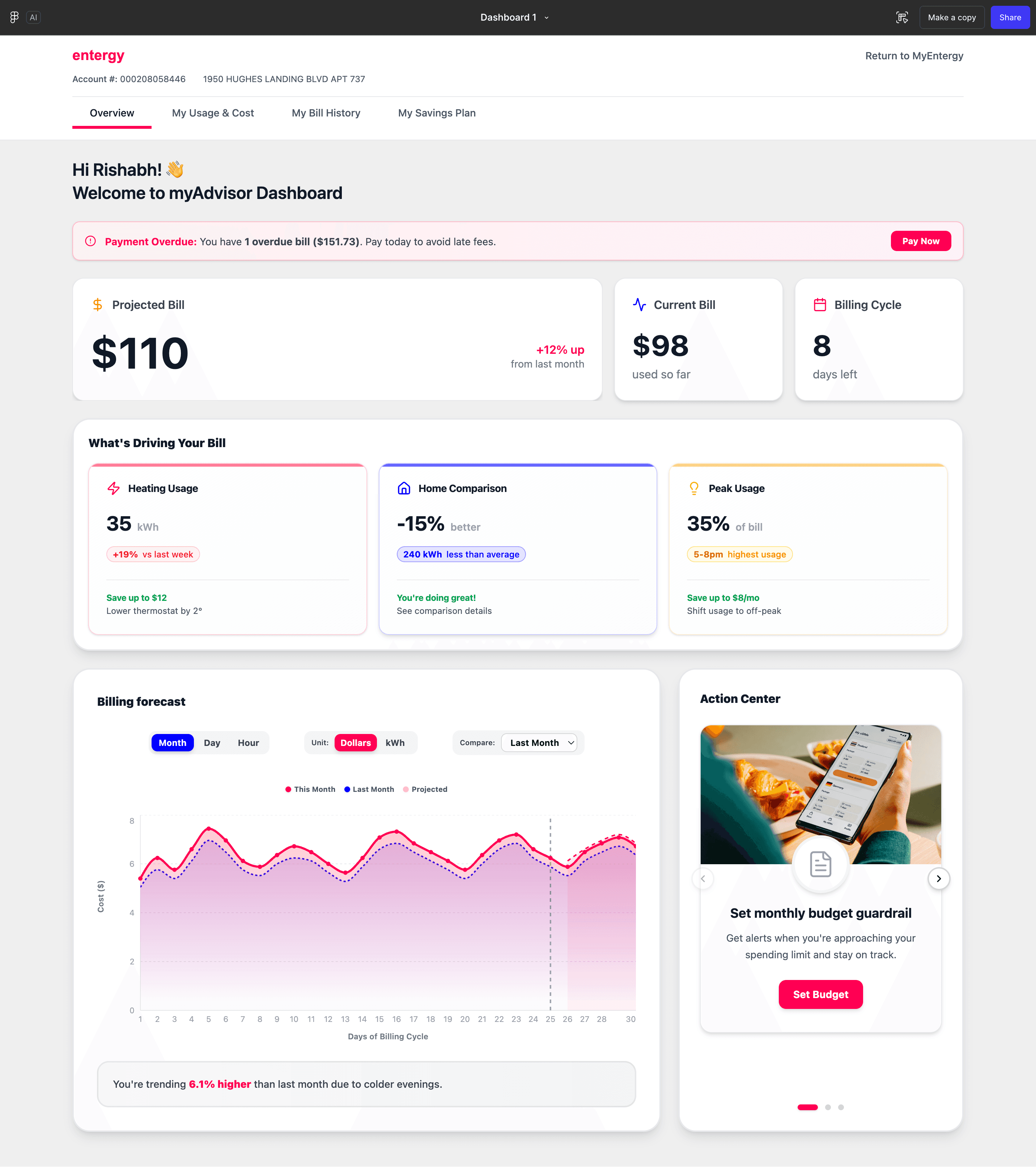
The dashboard scattered key information across small cards, forcing users to interpret their status. By introducing a clear, financial-first Energy Snapshot with real-time totals and projections, users can instantly understand where they stand, reducing uncertainty and increasing confidence.

The new Energy Snapshot surfaces bill status upfront
The projected bill.
% change vs last month
Current bill so far.
Days remaining in billing cycle
✅
No more digging for answers
✅
The key numbers now hit users instantly
✅
Financial clarity reduces uncertainty and builds trust
2. INSIGHT LAYER
From raw data to meaningful guidance, helping users understand what changed and why.
The original dashboard showed charts but didn’t explain them. Users had to interpret trends on their own. By introducing contextual insights that explain usage patterns and cost changes, the system now translates data into clear, human language.
The new Insight Layer explains what’s happening
“Usage increased due to colder evenings.”
“You’re using 15% less than similar homes.”
“Adjusting thermostat by 2° could save ~$12.”
✅
Less guesswork
✅
Clear cause-and-effect understanding
✅
Increased trust in the system

BILL FORECAST
From reactive billing to proactive planning, reducing bill shock before it happens.
Previously, users only knew their total once the bill arrived. By introducing a projected end-of-cycle cost range and trend line, the dashboard now gives early visibility into where the bill is heading.

The new Forecast makes future costs visible
Projected cost range
Trend line based on current usage
Mid-cycle risk signals
✅
Fewer surprises
✅
More time to adjust behavior
✅
Greater financial control
4. ACTION CENTER
From passive tools to guided action, turning insight into behavior change.
Savings programs previously lived in separate sections and felt disconnected from real usage data. By integrating actionable recommendations directly into the dashboard, users can respond immediately to insights.
The new Action Center enables real-time decisions
Set monthly budget guardrail
Reduce peak-hour usage
Schedule home assessment
✅
Higher savings engagement
✅
Clear next steps
✅
Stronger sense of control

5. INFORMATION ARCHITECTURE
From fragmented pages to a unified experience, reducing cognitive load.
Usage, billing, and savings were previously siloed across different pages. The redesign consolidates the experience around a single, structured flow: Overview → Usage → Bills → Savings.
The new structure simplifies navigation
Clear hierarchy
Financial-first prioritization
Related insights grouped together
✅
Faster comprehension
✅
Reduced mental effort
✅
More intuitive exploration

THE HYBRID PROCESS
Leveraging AI for Rapid Component Scaffolding
I leveraged Figma Make to explore various layout "stresses" for the Energy Snapshot.
This AI-assisted workflow drastically reduced the time spent on manual wireframing, allowing for a 60% faster iteration cycle and more focus on complex data visualization and user mental models.
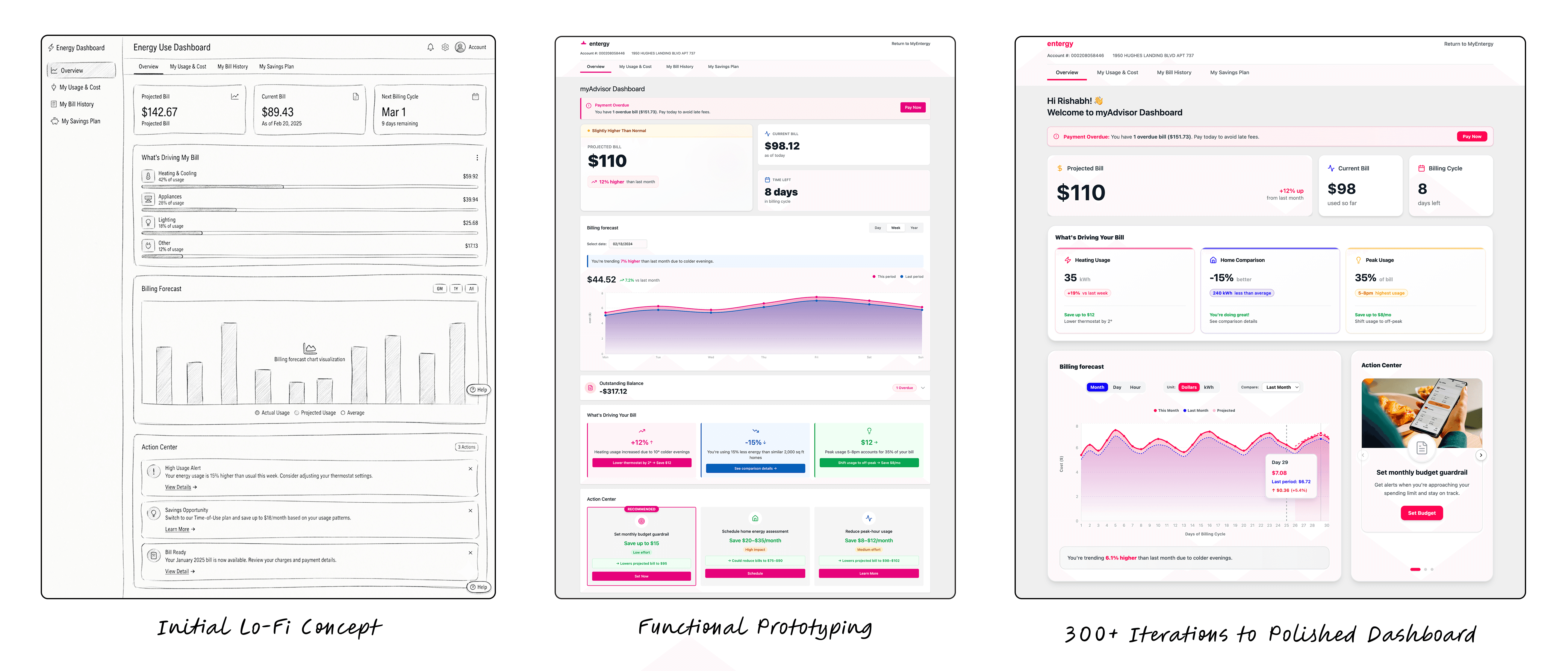
Fig: Initial Sketch/Logic (My brain) -> AI Scaffold (The "speed" phase) -> Final Polish & Heuristic Alignment
Validation & Measurement
How I would test and prove the shift
Because this redesign shifts the dashboard from retrospective reporting to predictive guidance, validation must prove both usability gains and business impact. I would structure validation across three levels: comprehension, behavior, and outcomes.
Pre-Launch (Usability Testing)
Method: Moderated usability testing + task-based evaluation
•
Time to clarity → Timed task completion (e.g., “How much will you owe this month?”)
•
Interpretation accuracy → Post-task comprehension questions
•
Confidence score → 5-point Likert scale after each task
Reduce cognitive load and increase user confidence.
Post-Launch (Behavior Validation)
Method: Product analytics + A/B testing
•
Support ticket analysis → Compare pre/post billing-related inquiries
•
Engagement metrics → Track mid-cycle logins and dashboard return rate
•
Action CTR → Measure clicks on savings prompts
•
Program enrollment → Monitor adoption lift vs. baseline
Goal: Prove measurable behavior and business impact.
Long-Term (Impact)
Method: Longitudinal analytics + perception tracking
•
Bill variance stability → Reduction in unexpected bill spikes over multiple cycles
•
Forecast feature usage → Repeat interaction and reliance on projections
•
Customer trust score → Periodic NPS or trust-focused survey benchmarks
Success: Reduced uncertainty and increased customer confidence over time.
Key Lessons

I learned to slow down before solving
The most important shift wasn’t visual, it was reframing the problem. Taking time to understand the system, the mental model, and the business context led to more meaningful design decisions.
Leveraging AI for rapid iteration
I became more disciplined about clarity over complexity
I deepened my accountability to outcomes
Thank you for reading! 🤍
More Projects
More Projects
ENTERGY'S CUSTOMER DASHBOARD
Redesigning a High-Stakes Enterprise Dashboard for Clearer Decision-Making
Enterprise Dashboard
|
Large Enterprise
|
Jan 2026 - Feb 2026
My Role
As a Senior UX Designer, I led this project end-to-end, rethinking the experience beyond visual updates. I identified clarity and structural gaps and redesigned Entergy's dashboard.
About the project
This was a self-initiated case study based on Entergy’s live My Energy Use Dashboard. I treated it like a real product, working within realistic technical and regulatory constraints.
Tools Used
Is the dashboard helping customers understand what’s happening or asking them to figure it out themselves?
The PROBLEM
The current My Energy Use dashboard is scattered and hard to follow. Usage, billing, and savings tools are spread across different pages, showing raw numbers without clear explanation or prioritization.
Customers have to figure things out on their own just to answer, “How much will I owe, and can I lower it?” Without forecasting or clearly surfaced savings options, this can lead to bill shock, low program use, and more support calls.
The data is accurate, but it doesn’t make things clear. The burden of understanding is placed on the user.
SOLUTION
The solution is to restructure the dashboard around what users care about most, this month’s bill, and then layer in helpful context and actions only when they’re needed.
Heuristic Evaluation
Heuristic Evaluation
Heuristic Evaluation
Problem Framing
Problem Framing
Problem Framing
User Mental Models
User Mental Models
User Mental Models
Experience Principles
Experience Principles
Experience Principles
Strategic Direction
Strategic Direction
Strategic Direction
Speculative Redesign
Speculative Redesign
Speculative Redesign
Hi-Fi Wireframes
Hi-Fi Wireframes
Hi-Fi Wireframes
Rapid AI Prototyping
Rapid AI Prototyping
Rapid AI Prototyping
Business objective
Ensuring the experience is both correct and easy to understand
Utility companies face growing pressure to reduce support call volume, strengthen customer trust, increase digital adoption, and drive participation in energy efficiency programs. By improving dashboard clarity and prioritization, Entergy can:
💵
Decrease bill-related confusion and cost uncertainty.
🤝🏻
Increase trust in the digital experience.
🛠️
Increase engagement with savings and efficiency tools.
💡
Position Entergy as a proactive, trusted energy partner.
Observing the Experience (What I Noticed)
Metrics without meaning create user anxiety
When I landed on the dashboard, I was presented with multiple cards: usage charts, comparisons, goals, tips, and programs. None of this was wrong. But nothing answered the question I instinctively had: Am I doing okay this month?
I had data, but no direction. I had metrics, but no meaning. I had to interpret everything myself, compare months, scan charts, calculate trends. That tension became the starting point for my evaluation and redesign.
Research & Evaluation
System prioritized displaying data over supporting decisions.
To better understand the experience gaps, I conducted a structured heuristic evaluation across the MyEnergy Use Dashboard, Usage & Cost, and Bill History pages using Nielsen’s usability principles. Six key violations emerged.
Fig. Heuristic evaluation across the my Energy Use Dashboard
Visibility of System Status
No clear trends or bill forecasting, making it hard to know if users were on track.
Match with Real-World Mental Model
The dashboard spoke in technical metrics, while users think in months and dollars.
Recognition Over Recall
Usage, billing, and savings were siloed, forcing users to piece information together.
Visual Hierarchy & Minimalism
Multiple charts competed for attention without clear prioritization.
Help Users Understand Issues
Increases in usage weren’t clearly explained, leaving users to interpret trends themselves.
Proactive Guidance
Savings tools were passive and disconnected from real-time insights.
Understanding the User
Most customers don’t visit an energy dashboard out of curiosity,
they visit when they’re concerned.
Energy is a variable monthly expense, and unpredictability creates anxiety. Users log in with simple, high-stakes questions:
How much will I owe?
Is this higher than last month?
Can I reduce it before the bill arrives?
They think in dollars and timing, not kilowatt-hours or efficiency tiers.
Primary Persona
The Cost-Conscious Household Manager
Profile
Logs in 1-2 times per billing cycle
Responsible for managing monthly expenses
Not technically inclined
Motivated by predictability and savings
Pain Points
Scattered information
No bill forecast
Charts without explanation
Unclear next steps
Goals
Avoid bill surprises
Understand why costs changed
Adjust behavior before the cycle ends
Defining Experience Principles
Aligning experience with user priorities
To move beyond cosmetic improvements, I established five guiding principles. These principles became the foundation of the redesign.
1.
Prioritize what matters now
2.
Make energy financial, not technical
3.
Surface insights, not raw metrics
4.
Introduce forward-looking forecasting
5.
Enable action in context
Redesign overview
From static reporting to proactive energy guidance
A clear insight emerged: the dashboard made users interpret everything themselves. It showed data, but not meaning. And in a high-stakes product tied to monthly bills, that uncertainty erodes trust.
The redesign shifts the experience from passive reporting to proactive guidance, clearly showing where users stand, what’s next, and what they can do about it.
1. Energy Snapshot
From scattered metrics to instant financial clarity, giving users confidence before concern.
The dashboard scattered key information across small cards, forcing users to interpret their status. By introducing a clear, financial-first Energy Snapshot with real-time totals and projections, users can instantly understand where they stand, reducing uncertainty and increasing confidence.
The new Energy Snapshot surfaces bill status upfront
The projected bill.
% change vs last month
Current bill so far.
Days remaining in billing cycle
✅
No more digging for answers
✅
The key numbers now hit users instantly
✅
Financial clarity reduces uncertainty and builds trust
2. INSIGHT LAYER
From raw data to meaningful guidance, helping users understand what changed and why.
The original dashboard showed charts but didn’t explain them. Users had to interpret trends on their own. By introducing contextual insights that explain usage patterns and cost changes, the system now translates data into clear, human language.
The new Insight Layer explains what’s happening
“Usage increased due to colder evenings.”
“You’re using 15% less than similar homes.”
“Adjusting thermostat by 2° could save ~$12.”
✅
Less guesswork
✅
Clear cause-and-effect understanding
✅
Increased trust in the system
BILL FORECAST
From reactive billing to proactive planning, reducing bill shock before it happens.
Previously, users only knew their total once the bill arrived. By introducing a projected end-of-cycle cost range and trend line, the dashboard now gives early visibility into where the bill is heading.
The new Forecast makes future costs visible
Projected cost range
Trend line based on current usage
Mid-cycle risk signals
✅
Fewer surprises
✅
More time to adjust behavior
✅
Greater financial control
4. ACTION CENTER
From passive tools to guided action, turning insight into behavior change.
Savings programs previously lived in separate sections and felt disconnected from real usage data. By integrating actionable recommendations directly into the dashboard, users can respond immediately to insights.
The new Action Center enables real-time decisions
Set monthly budget guardrail
Reduce peak-hour usage
Schedule home assessment
✅
Higher savings engagement
✅
Clear next steps
✅
Stronger sense of control
5. INFORMATION ARCHITECTURE
From fragmented pages to a unified experience, reducing cognitive load.
Usage, billing, and savings were previously siloed across different pages. The redesign consolidates the experience around a single, structured flow: Overview → Usage → Bills → Savings.
The new structure simplifies navigation
Clear hierarchy
Financial-first prioritization
Related insights grouped together
✅
Faster comprehension
✅
Reduced mental effort
✅
More intuitive exploration
THE HYBRID PROCESS
Leveraging AI for Rapid Component Scaffolding
I leveraged Figma Make to explore various layout "stresses" for the Energy Snapshot.
This AI-assisted workflow drastically reduced the time spent on manual wireframing, allowing for a 60% faster iteration cycle and more focus on complex data visualization and user mental models.
Fig: Initial Sketch/Logic (My brain) -> AI Scaffold (The "speed" phase) -> Final Polish & Heuristic Alignment
Validation & Measurement
How I would test and prove the shift
Because this redesign shifts the dashboard from retrospective reporting to predictive guidance, validation must prove both usability gains and business impact. I would structure validation across three levels: comprehension, behavior, and outcomes.
Pre-Launch (Usability Testing)
Method: Moderated usability testing + task-based evaluation
•
Time to clarity → Timed task completion (e.g., “How much will you owe this month?”)
•
Interpretation accuracy → Post-task comprehension questions
•
Confidence score → 5-point Likert scale after each task
Reduce cognitive load and increase user confidence.
Post-Launch (Behavior Validation)
Method: Product analytics + A/B testing
•
Support ticket analysis → Compare pre/post billing-related inquiries
•
Engagement metrics → Track mid-cycle logins and dashboard return rate
•
Action CTR → Measure clicks on savings prompts
•
Program enrollment → Monitor adoption lift vs. baseline
Goal: Prove measurable behavior and business impact.
Long-Term (Impact)
Method: Longitudinal analytics + perception tracking
•
Bill variance stability → Reduction in unexpected bill spikes over multiple cycles
•
Forecast feature usage → Repeat interaction and reliance on projections
•
Customer trust score → Periodic NPS or trust-focused survey benchmarks
Success: Reduced uncertainty and increased customer confidence over time.
Key Lessons
I learned to slow down before solving
The most important shift wasn’t visual, it was reframing the problem. Taking time to understand the system, the mental model, and the business context led to more meaningful design decisions.
Leveraging AI for rapid iteration
I became more disciplined about clarity over complexity
I deepened my accountability to outcomes